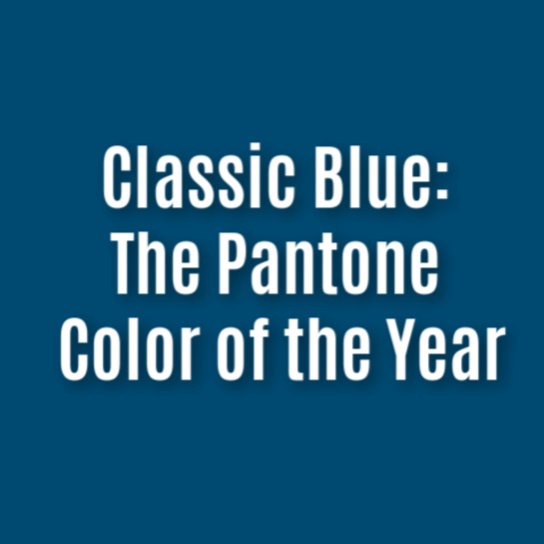

Calm, confident and elegant – why this year’s Pantone Color of the Year is a classic
Don’t forget to check out our PR and marketing checklist for leveraging CoTY
AMERICAN colour institute Pantone has today revealed its Color of the Year for 2020. And it’s a classic. Classic Blue – PANTONE 19-4052 – to be exact.
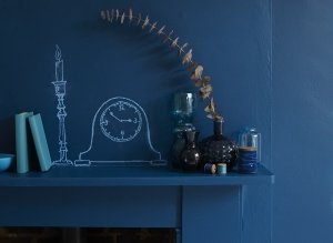
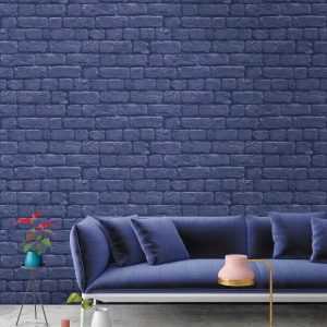
A timeless and enduring blue hue, Classic Blue is calm yet confident, exuding stability in this most unpredictable of times.
Evocative of the night sky, the reassuring qualities of Classic Blue highlight the need for a dependable foundation as we head into 2020.
A favourite in modern kitchens, Classic Blue is a restful colour and one that brings with it peace and tranquillity.
It’s also good for the mind; helping concentration and bringing clarity.
[fusion_builder_container hundred_percent=”yes” overflow=”visible”][fusion_builder_row][fusion_builder_column type=”1_1″ background_position=”left top” background_color=”” border_size=”” border_color=”” border_style=”solid” spacing=”yes” background_image=”” background_repeat=”no-repeat” padding=”” margin_top=”0px” margin_bottom=”0px” class=”” id=”” animation_type=”” animation_speed=”0.3″ animation_direction=”left” hide_on_mobile=”no” center_content=”no” min_height=”none”]
Leatrice Eiseman, executive director of the Pantone Colour Institute, said: “We are living in a time that requires trust and faith. It is this kind of constancy and confidence that is expressed by PANTONE 19-4052 Classic Blue, a solid and dependable blue hue we can always rely on.
“Imbued with a deep resonance, Classic Blue provides an anchoring foundation. A boundless blue evocative of the vast and infinite evening sky, Classic Blue encourages us to look beyond the obvious to expand our thinking; challenging us to think more deeply, increase our perspective and open the flow of communication.”
Easily relatable, Classic Blue lends itself to relaxed interaction. Associated with the return of another day, this universal favourite is sure to be embraced by all.
[/fusion_builder_column][fusion_builder_column type=”1_1″ background_position=”left top” background_color=”” border_size=”” border_color=”” border_style=”solid” spacing=”yes” background_image=”” background_repeat=”no-repeat” padding=”” margin_top=”0px” margin_bottom=”0px” class=”” id=”” animation_type=”” animation_speed=”0.3″ animation_direction=”left” hide_on_mobile=”no” center_content=”no” min_height=”none”]
[/fusion_builder_column][/fusion_builder_row][/fusion_builder_container]