Have you ever checked in to a day spa and felt instantly relaxed, despite not even having so much as glanced at a treatment menu. Is it the incessant chiming of spa music or the superbly sniffable scent of eucalyptus and lavender? Or is it something altogether different?
The true answer is that it is possibly a combination of things, but the biggest factor is the colour of the interior. Colour is closely connected to our emotions, vivid colours make us feel energised, think neon nightclub, whereas neutral shadings instantly relax us, i.e. spa scenario.
[fusion_builder_container hundred_percent=”yes” overflow=”visible”][fusion_builder_row][fusion_builder_column type=”1_1″ background_position=”left top” background_color=”” border_size=”” border_color=”” border_style=”solid” spacing=”yes” background_image=”” background_repeat=”no-repeat” padding=”” margin_top=”0px” margin_bottom=”0px” class=”” id=”” animation_type=”” animation_speed=”0.3″ animation_direction=”left” hide_on_mobile=”no” center_content=”no” min_height=”none”]
If you are starting a new design project, your starting point should be based on the mood you are looking to create. What activity is this room used for? Are you looking for deep slumber or do you want to create a room ripe for activity? Check out the colour guide below.
True Blue
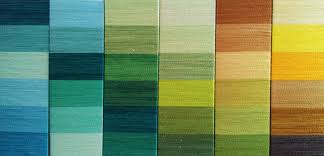
Have you ever wondered why the world of executives is filled with navy clad suits? Blue, particularly deep hues, are strong colours, associated with confidence and success. A colour for the study? Dial back to lighter shades and feel the calm descend, sleep inducing and foam filled bathing.
Daring colours need not equate to crass. Indeed quite the opposite when done well. Of course red also brings the drama, the passion, the power…just ask Jane Austen! Red lends itself to the creative mind, often used in theatres of yesteryear. In it’s purest forms, red appears traditional. For a pop art dimension, opt for a juicer shade.
Back To Black.
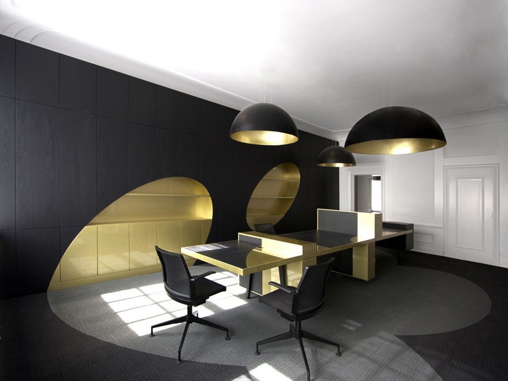
Black is a staple. It’s a go to colour because it requires little commitment, meaning it will happily sit alongside most other colours on the spectrum. It’s timeless, its’ classic and definitely sophisticated. But how does it make us feel? Black used in interiors works in the same way as black on the catwalk. It ignites an allure that no other colour can challenge.
[/fusion_builder_column][fusion_builder_column type=”1_1″ background_position=”left top” background_color=”” border_size=”” border_color=”” border_style=”solid” spacing=”yes” background_image=”” background_repeat=”no-repeat” padding=”” margin_top=”0px” margin_bottom=”0px” class=”” id=”” animation_type=”” animation_speed=”0.3″ animation_direction=”left” hide_on_mobile=”no” center_content=”no” min_height=”none”]
In The Pink.
Having a problem with pink is like the last interior taboo! We accept that little girls love it, but pink does not like to discriminate and it’s nurturing ambience will transcend perfectly to adult bedrooms and the living room. The key for pink walls is to think about pattern or texture. Graphic designs will ensure the look is smart. Make a statement with teak wood accessories.
It Was All Yellow.
[/fusion_builder_column][fusion_builder_column type=”1_1″ background_position=”left top” background_color=”” border_size=”” border_color=”” border_style=”solid” spacing=”yes” background_image=”” background_repeat=”no-repeat” padding=”” margin_top=”0px” margin_bottom=”0px” class=”” id=”” animation_type=”” animation_speed=”0.3″ animation_direction=”left” hide_on_mobile=”no” center_content=”no” min_height=”none”]
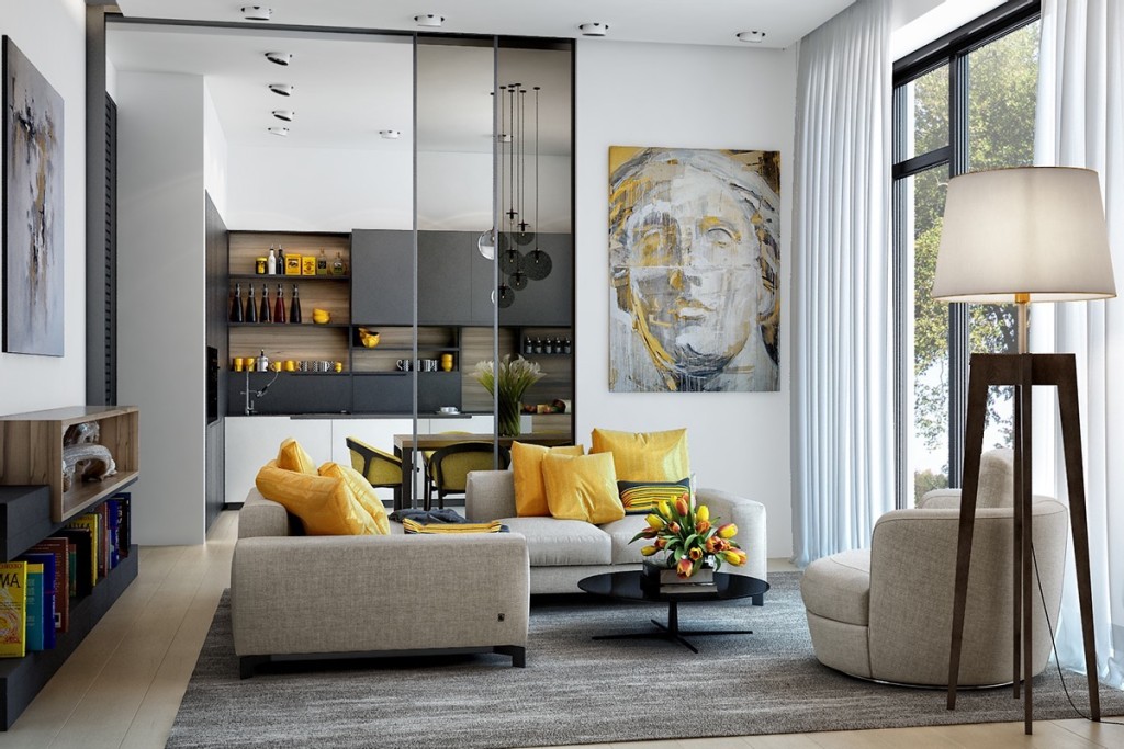
Yellow is a colour of optimism. It has a vibrant, young and fresh feel, perfectly suited to teenage hangout zones. However who knew that yellow could be elegant? Tone down brighter hues with greys and deep creams, or mute the look in golden shades.
All the colours of the rainbow are viable for room interiors when thoughtfully executed. To check which colour mood suits you best, trying wearing a piece of clothing and consider how it makes you feel!
[/fusion_builder_column][/fusion_builder_row][/fusion_builder_container]

