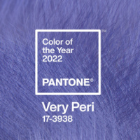

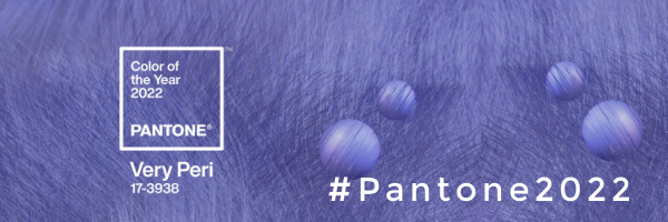
Pantone have announced their Colour of the Year for 2022: introducing Very Peri.
A modern periwinkle, with hints and undertones of purple, lavender and blue, this vibrant shade marks the first time since Pantone have created a brand new hue for their Colour of the Year.
Very Peri – or PANTONE 17-3939 – represents the challenging times we are all going through and is looking to the future.
Here, designers from leading UK interior brands share their opinion on Very Peri and offer their take on how to use it in the home:
[rev_slider alias=”slider-2″ slidertitle=”Slider 2″][/rev_slider]
Beth Travers, founder and creative director of design house Bobo1325, says:
“When it comes to considering colour, it’s a lot more than just looking with our eyes. The power comes from the feelings which it evokes. Making the things we don’t see are just as integral as those that we do.
“Colour has the power to influence both moods and mindsets. For instance the colour purple has long being associated with Royalty therefore giving you the feeling of richness which will go hand in hand with the luxury, power and nobility that it emanates.
“Pantone’s Colour of the Year Very Peri is all of those things but also so much more, as the tone of purple chosen also reflects the spiritual side; it’s relaxing, soothing and a perfect balance.
“We’ve seen lilac and lavender become more dominant throughout fashion and now it’s the turn of the interiors we will see flashes and accents of Very Peri utilised in spaces, harnessing colour harmonies to evoke feelings within. I felt excited when I saw the announcement as this is a colour I can totally get behind I feel excited about introducing it into new works as well as seeing it throughout existing works.”
Victoria Yardley, founder of eco-friendly paint brand Victory Colours, said:
“We’re all about lilac and purple hues here at Victory Colours, and have been predicting their comeback for the past few months. Harlech, and Crocus Field are flying off the shelves at the moment and our brand new Iris Pallida from the Addicted to Patterns Harmony 2022 Collection ticks all the periwinkle boxes.
“These hues draw their inspiration from nature and the calming tones have a serene vibe. Pair with ever popular, earthy greens like Cloud Tree or Novara Green or with Victory White for a crisp, fresh contrast.”
Holly Ghent, of mid-century reproduction specialists, Pash Classics, said:
“The meaning behind Pantone’s Colour of the Year is very relevant. Society has had a lot of pressure and accountability in the past couple of years, with the COVID-19 pandemic and a major emphasis on our responsibility to improve our lifestyles due to climate change. While not being able to embrace all these new changes at once, society is holding onto some traditional norms while embracing new ones.
“Very Peri will be a beautiful accent colour for people’s homes. Interiors trends have shifted from the idea of minimalism to maximalism, Very Peri embodies this shift. For anybody who takes a bright and fun approach to interior design, we can see the colour being used a lot in 2022.”
Furniture artist, Claire Manton, of Claire’s Crafthouse, said:
“Pantone’s ‘Very Peri’ is a refreshing departure from the usual reliance on archive shades. We think it reflects a period where life has been turned on its head and we have had to learn to exist both outside of the comfort zone of our normal daily routines, but more within the comfort zone of our homes.
“In 2021 we have seen increasing adventurous use of colour in interiors, as we’ve sought to inject relief and happiness into our surroundings. The creativity of Very Peri, and its balance of dependable blue with invigorating red, is an exciting prediction for interiors in 2022.
“The appearance of fur texture in Pantone’s announcement imagery is particularly interesting. In the furniture restyling world we have seen a marked return to the preservation of materials in their natural form, paired with colour and pattern. Even dark woods, that have been painted over for years, are now being celebrated. The removal of nasty old varnishes reveals beautiful woodgrains, which look exquisite and contemporary alongside bright, dark and neutral hues, as well as contrasted with decoupaged bold print papers and fabrics.”
Simon Critchley, founder of design house Carmine Lake, said:
“Predicting an emerging colour trend is a very important aspect for many industries.
“Pantone’s COTY is hoping to push their prediction firmly into people’s minds and subconscious in the hope that designers and consumers pick up on it.
“On the positive side, COTY can help focus product and design throughout all categories.
“It helps drive consumer purchasing. It can influence innovation and creativity, it moves fashion and style forward and can bring attention to colours and colour combinations in ways that consumers may not have considered before.
“On a negative side, colour trends can create a boundary around style and design and can hem your product in.
“At Carmine Lake we love colour and we keep an eye on what’s is going on, but we stay fluid, we don’t let other people’s predictions guide us. Unless of course we like them.”
Liam Barrett, of design house Lakes & Fells, said:
“Very Peri is just what we needed coming out of the slumber of our post covid world. Vivacious and lively, the Periwinkle blue tone gives the warm feeling of new beginnings with the enthusiastic hope of the future with its red undertones. Being someone who loves vibrant prints, this is a great choice for Pantone color of the year!”
Wallpaper design Elizabeth Ockford, said:
“I love the Pantone colour of the Year VERY PERI
“Blue is such tranquil colour and this one has warm undertones to it – it reminds me of spring flowers – bluebells and Irises.
“It’s a hopeful colour- and we all need optimism now. Its so nice to see a real colour being chosen – I think it shows that we are all needing to be a little bit more daring and move ourselves out of the doldrums.”
View and download images from our Pantone Colour of the Year collection on Press Loft now